KeyBank
Online help and support for banking customers.
UX/UI case study, 2020
Business objective
Reduce contact center calls for online banking.
NPS rating was negatively affected when users had to call support. By providing help online, we hoped to raise our rating.
UX goal
We wanted to create a way for banking customers to find help within the authenticated web and app prior to calling the contact center.
Although my only area of impact was the support experience, whenever possible, I worked with other teams to fix those confusing experiences.
Previous experience & issues
Before the customer service redesign, the contact information and our help articles were on separate pages and difficult to find. Our support articles were also descriptive how-to’s rather than questions people actually called about. We wanted to direct customers to common questions prior to calling the support center.
We also wanted to add search across our site to easily navigate to the information or actions.
Customer service contact info
List of help articles
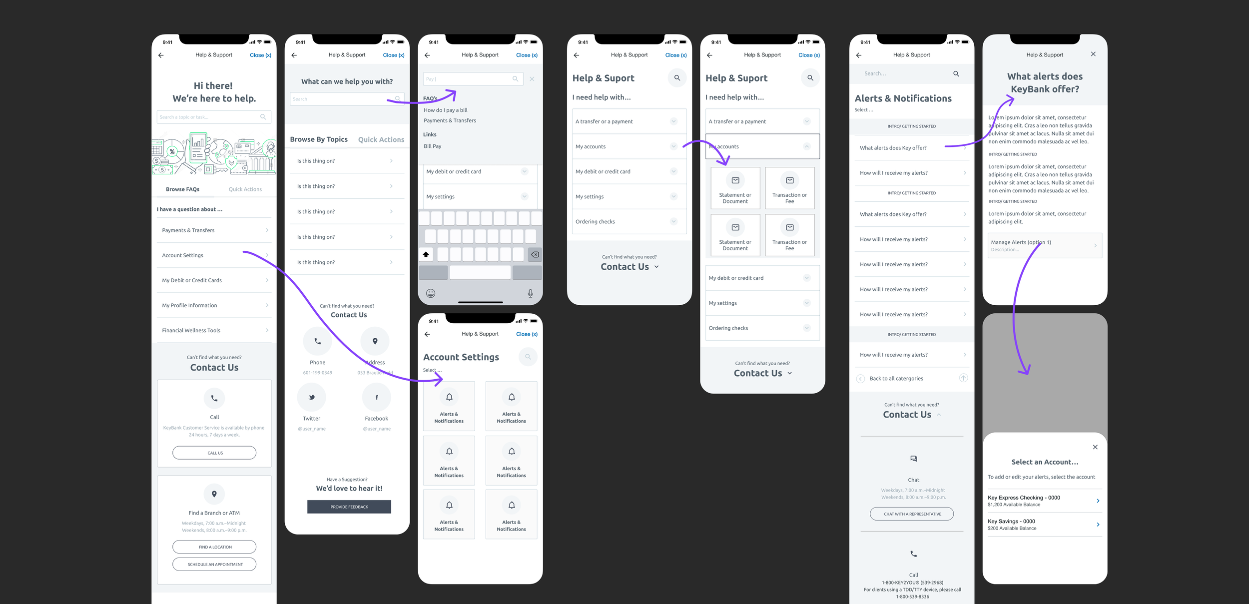
Mobile help experience
The contact information in the app was hidden behind a Key logo in the bottom navigation and was hard for customers to find.
There were some articles and videos on the website but they did not exist on the app.
Qualitative & quantative research
Looking at data, we reviewed some of the top complaints customers had in both the contact center and through direct feedback.
We also held several expert interviews with representatives, and listened to dozens of call center recordings to hear first hand why customers were actually experiencing these issues.
Content strategy
We started with the content. From our research and analytics we had a better picture of what issues users were experiencing. I audited all existing support articles, and based on our interviews from the contact center, I included and prioritized additional topics.
Organizing the content into a few different architectures, I ran a tree test to review the navigation of the help articles.
Go (navigate)
Know (information)
Do (how-to)
As we were researching best practices for search, we found people often use search to go somewhere, do something , or know something. We expanded this idea beyond search and into our whole customer service journey.
After all, the online customer service center was a last resort to help people navigate tricky banking situations.

Concepts & wireframing
After loosely defining product requirements with the product manger, I created a rough prototype to share with stakeholders. As well as including all the contact information, we wanted to emphasize common information and tasks.
Go/ Navigate
“Where can I to order more checks?”
To help users navigate, we created a list of quick links. We knew from previous studies that our users have a difficult time finding in-frequent tasks, such as ordering checks. It was a quick fix, as we hoped to provide access points that would allow us to create a better global architecture.
Know/ Information
“How does a pending transaction affect my credit card statement?”
Previously, Key only had how-to articles. It was our belief that users shouldn’t have to read how-to articles. Therefore we focused on informational articles with common questions such as “how does a pending transaction affect my credit card statement?”.
Do/ How-to’s
“How do I set up a monthly payment?”
For difficult experiences, we worked with other product managers to prioritize fixes to the experience rather than writing how-to articles. For experiences we could not change in the near term, we kept existing help articles as a last resort.
Testing web & app navigation
We explored options for improved navigation. Based on our research, we proposed switching out the Key icon for something more recognizable on mobile. I ran a few click tests on other support or contact icons. While some icons tested best for help or contact information, the question mark tested better when considering both instances.
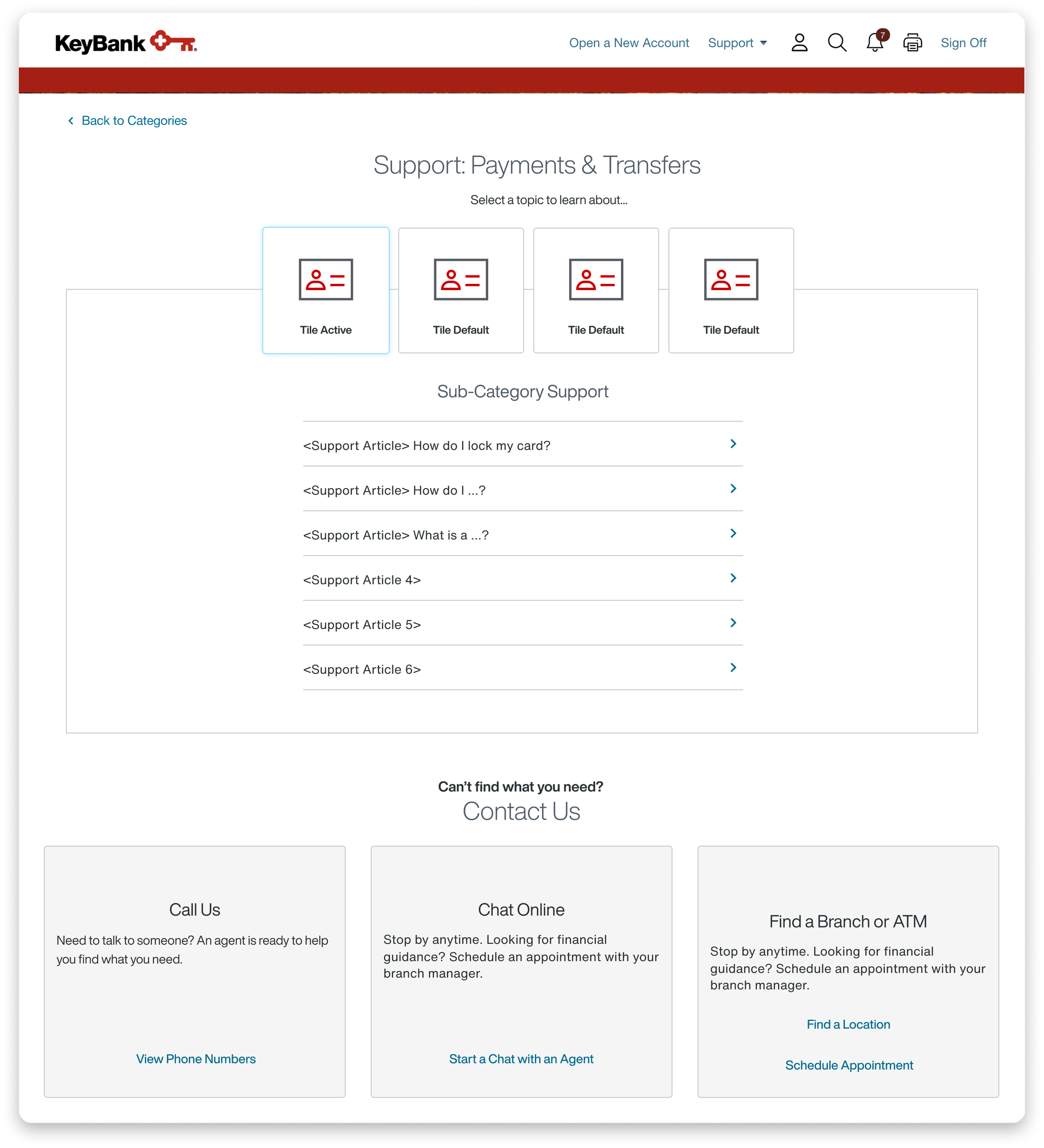
On web, we reduced confusion by getting rid of the drop down under support and changed the verbiage as recommended by our UX Writer. We also used the opportunity to address additional visual updates.
Previous navigation:
key icon
Winning solution:
(?) icon
Previous navigation
Updated navigation
Web refinement
refining web layouts to help users easily navigate through the different help topics, while maintaining consistency within our design system.
Improved authenticated help & support
Impact
Directly after the first release of the customer service experience, we saw an increase in article views and an increase in transactions from the links in “Quick Actions”.
Improvements
Navigation to the authenticated customer service information.
Hierarchy of information to help users find answers prior to calling.
Improved organization of our FAQs.
For the FAQ articles:
We used our existing full screen modal pattern to display the articles. Therefore, a user could access the info from other experiences, find their answer, close the modal, and remain in the experience.
I created a few different types of templates based on the different types of articles. These templates were used in our content management system
I wrote additional support topics, focusing on resolving confusing banking terms rather than “how-to’s”.


