Seasoned
Helping jobseekers manage and schedule interviews
Case study, Continual improvement from 2020–2022
Background
Seasoned is a platform that helps jobseekers in the restaurant industry find work and connect with their local service industry community— think LinkedIn but exclusively for restaurant workers.
Our goal was to improve the application-to-interview conversion rate in order to increase the number of hires for both applicants and restaurants.
UX issues
Our navigation posed a challenge for applicants seeking to manage past applications, schedule interviews, and track application status.
As a vital part of our business, we hoped to reframe our app around interviews and applications, making it easier for jobseekers to attend interviews and get hired.
Uncovering pain points
Feedback from users & ongoing issues
Further investigation
UserTesting gave us additional insights into applicants’ first time experiences. We found:
Our app was super buggy! Loading times were very long. And switch between “my applications” and “jobs” created bugs and confusion for users.
The page navigation tabs were hidden when a jobseeker was scrolling, making it difficult for users to locate their application status when they were halfway down the page.
The tab navigation was overlooked, and users could not easily find their applications. Or if they were viewing their applications, the couldn’t easily navigate back to search jobs.
We saw quite a few posts which suggested we had pretty bad navigation, and users had a hard time finding their applications. I felt it could be better.
Interview statuses—whether it was scheduled, requested, or needed rescheduled—was a bit ambiguous. Applicants would show up to interviews, even though it was only requested and not actually scheduled.
Applicants received notifications, texts, and emails with links to schedule their interviews, but we noticed links didn’t always work.
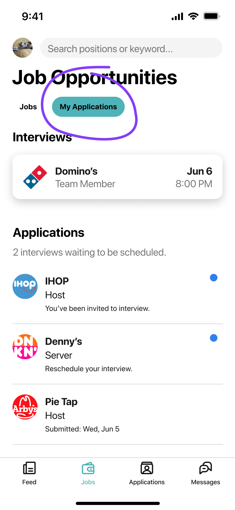
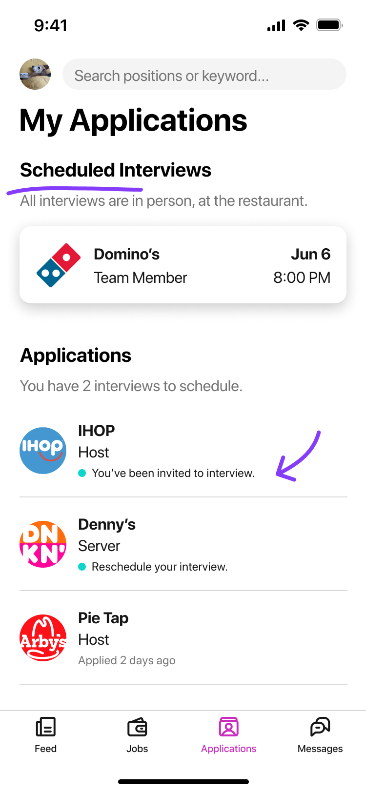
< Before
Immediate UI & copy updates
As a short term fix, we made some adjustments to hopefully improve clarity.
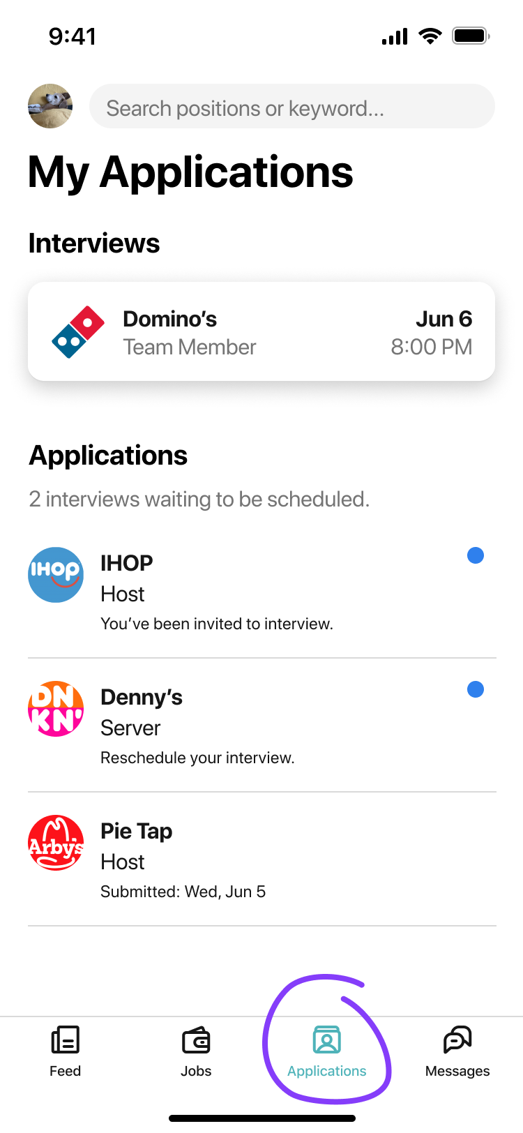
We changed ‘My work’ to ‘My applications’.
We removed 'Gigs' and 'available to work' as they provided no benefits to users or our business, allowing us to refocus on the core features of Seasoned.
We redesigned the page navigation to remain visible at all times, providing users with easy access to their application status regardless of their position on the page
(note: search was changed right as I was onboarding)
Squashing bugs 🪲
Through dogfooding the app with other team members, we identified multiple performance issues. Our dev team then overhauled the app, significantly improving the user experience. I supported the dev team with loading experiences and desired interactions, as needed.
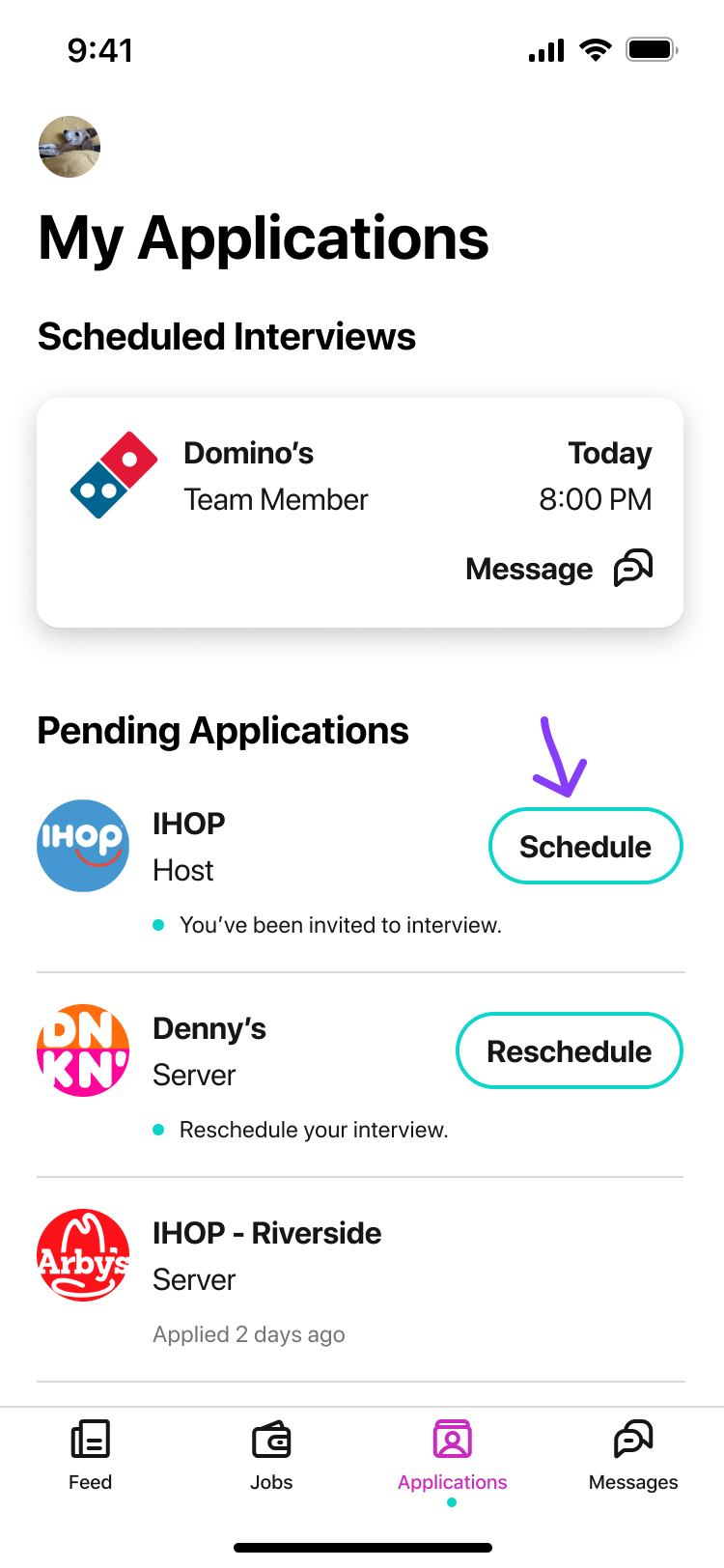
After >
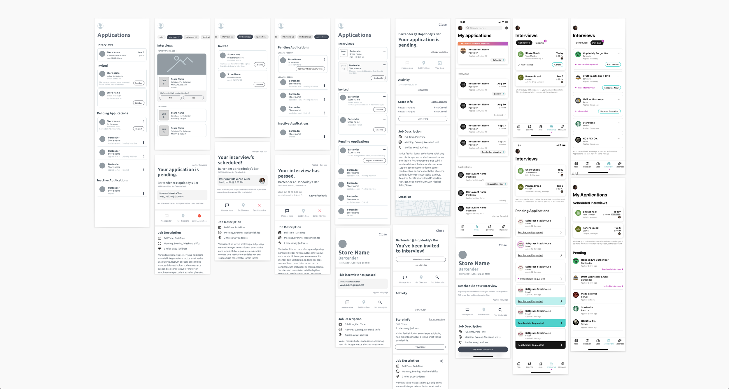
Initial wireframes
I explored different approaches to organizing interviews and applications while highlighting key actions.
Continual refinement through testing.
While the devs continued prioritize performance fixes, I continued testing different concepts, narrowing in on a solution to help users understand and manage their applications.
Q: Which navigation label worked better: application or interviews?
Findings:
Both 'interviews' and 'my applications' tested equally well across 10 users.
We chose 'my applications' as it provided a more comprehensive view of users' application status, including scheduled interviews and pending applicants.
Divide applications into separate tabbed pages: scheduled or pending.
Maintain the list view, reworking heirarchy and labels.
Q: Was there a better way to organize a jobseeker’s applications?
Feedback and findings:
Internal team members rightfully pointed out that many users would frequently encounter empty states if we divided out the applications.
In user research, I observed that when presented with a list view users could easily compared one job to the next to help them comprehend each application status.
Additionally, I was hesitant about reintroducing page navigation.
Therefore, we remained with something close to our original list view.
Prioritize applications with actions to increase our conversion rates.
Q: Could users easily discern a scheduled interview from a requested interview?
Findings:
Updates through the apply flow made it much more clear.
The use of a blue or pink 'notification dot' helped users identify when an update to their application was required.
Additional updates to the 'scheduled interviews' header further clarified the status.
Note: the confirmed interviews was a separate feature being considered and I wanted to see how it affected clarity.
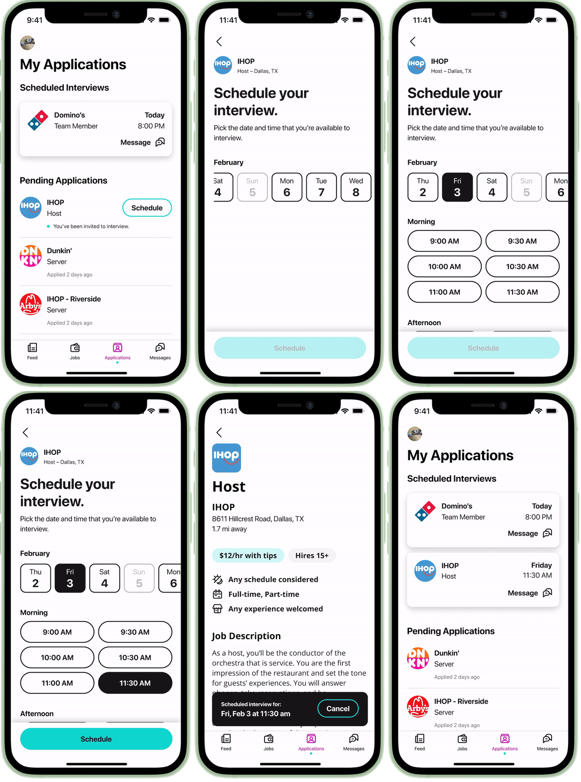
Scheduling an interview and viewing the details.
Actions for each interview are clearly presented in the list view, encouraging applicants to schedule their interviews.
Applicants can still view the original job listing when they tap into the list.
Envisioning it all together…
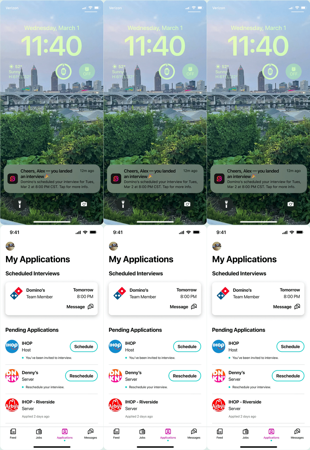
Our redesigned bottom navigation made it easier for users to find their interviews.
Inline buttons for each action provided a quick way for them to schedule their interviews.
We also adjusted the copy as needed to clarify what was expected for each application and interview.
In addition, we fixed the format of dates and added 'Today' and 'Tomorrow' labels to make it easier for users to understand when their interviews were scheduled.
< View
Schedule >
Considering the empty states.
Previously, the "Interviews" section was hidden if there weren't any interviews scheduled. This made it confusing for job seekers as they thought their applications were scheduled.
Showing empty states made it clear to users that there were no scheduled interviews.
We also included a CTA if job seekers had not applied to jobs yet.
Incremental improvements
With a vision in place we could start breaking up the redesign into sizable work. Below is a timeline of how we got to the desired updated state, while prioritizing additional high priority work.
Through this work and additional enhancements, the percent of interviews scheduled increased from 10% to 25%
Continual improvement to the jobseeking journey…
Additional opportunities exist to better assist applicants through the application and interview process.
Improve and address all possible interview states.
We didn't adequately handle post-interview applications and overlooked some interview states that could clarify the process for job seekers.
What information do users need when they have a scheduled interviews?
At present, we display all of a jobseeker’s application details over the original job listing. It could be useful for applicants if we determined the most crucial information to highlight for each interview, such as:
Directions, interviewer's name, venue hours, and onsite parking availability. However, getting accurate information from the restaurant proved to be a bit challenging.
Celebrate job seekers' success when they secure a job.
Consider introducing features to share their achievements on the feed, as often done by other members. Alternatively, provide guidance for onboarding and training in their new role.


