StationCheck
Keeping firefighters prepared and ready.
Research case study, 2016
Project background
Firefighters need to perform up to 5 inspections per day to ensure equipment is well maintained. StationCheck is a digital app to organize inspections, keeping fire stations prepared and ready.
As a startup, StaionCheck approached our design firm to revamp their app in order to increase sale. The old site was difficult to use, unresponsive to different device sizes, and had a lot of confusing features.
My role
Working within a design consultancy, we typically collaborated at the beginning stages of a project. I lead research and worked along side team members on UX wireframes. Due to time and budget constraints, another team member took over the final branding and UI.
Field research
We interviewed a variety of employees from three fire departments as they used the app and performed equipment checks. In addition, we had three phone interviews to understand the behavior, needs, and preferences.
Analyzing insights from research
Identifying Pain Points & Areas of Opportunity
We documented our findings from research based on the firefighters’ journey throughout the app, from onboarding to closing out the tasks. I also shared examples of best practices to persuade our clients to consider other opportunity areas.
TL;DR version
The original site was very challenging to navigate, even for frequent users. After our interviews, we discovered the following issues:
The dashboard and assignments were not well organized. It was difficult to understand what was assigned to who.
The language was confusing and inconsistent.
Colors indicating task urgency were difficult to distinguish and not accessible for colorblind individuals.
Poor error prevention throughout the site led the user down dead-end paths.
User types & goals
While interviewing a variety of staff, we identified two main roles and each of their tasks within the fire station.
Chiefs & Lieutenants
Oversee station and engine readiness
Complete the inventory and equipment checks
Create extra tasks and assign them to individuals
Ensure critical tasks are completed
Staff & Volunteer Firefighters
Complete the inventory and equipment checks
Fault equipment which fails inspection
Fix faulted items and update the task list

Ideation: organizing the information
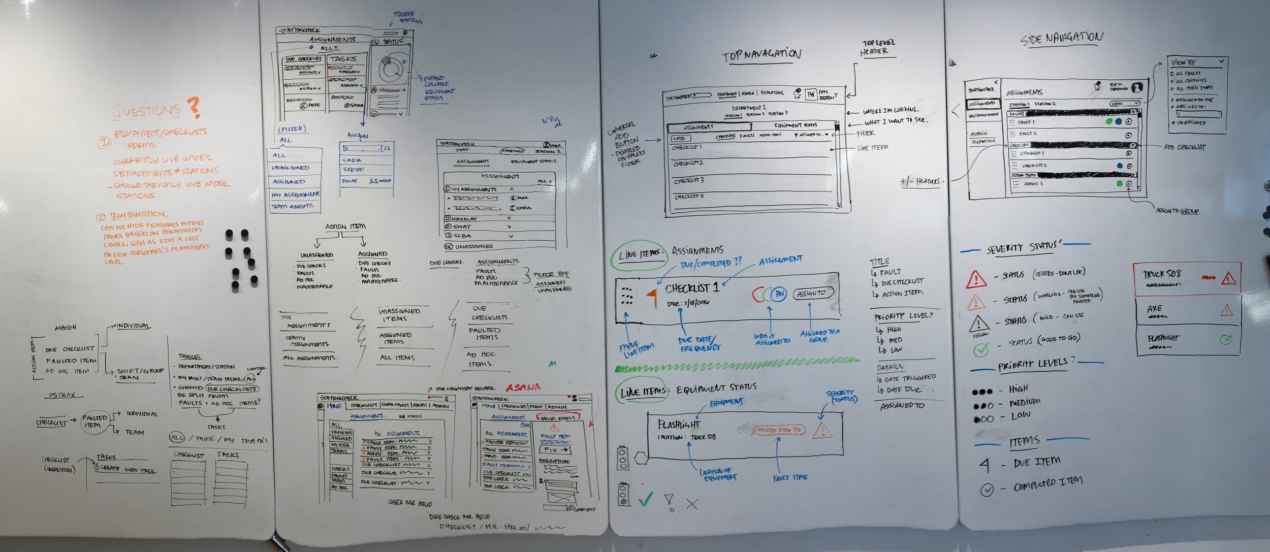
As a team, we brainstormed different ways to organize the checklists, items, and tasks, creating clear and manageable user flows for each identified task.
my doodles
Dashboard concepts
As the central point of interaction, dashboard concepts were explored in a responsive platform to organize the critical information: inspections, tasks, faults, and equipment status. Referencing the user insights, I focused on quickly visualizing equipment and station readiness.
Wireframing user flows
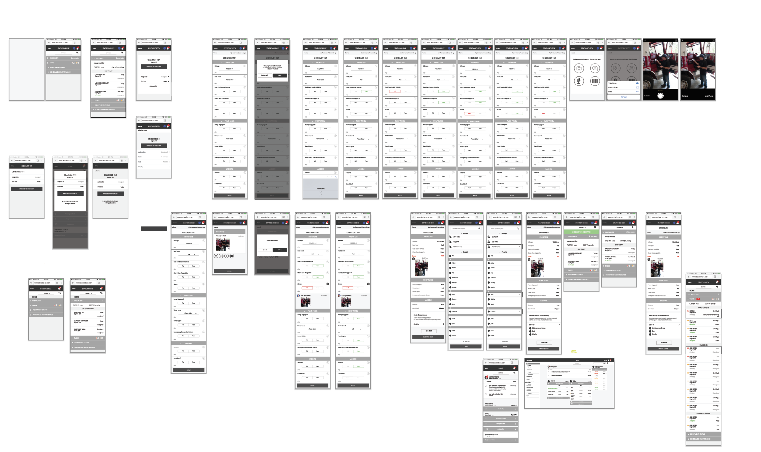
We created low fidelity wireframes for each of the major tasks.
Closing out a task: After failing an inspection, the sirens have now been fixed. The firefighter that fixed them would now like to closeout the task.
list of tasks
mobile dashboard
review & closeout
task detail
updated!
add additional details (optional)
Clarifying the copy.
The website previously used multiple terms interchangeably and confusing copy. During interviews we noted firefighters natural language and tried to work with the client to update specific terms. We created a glossary of terms for the client so that the consistency could continue after our project had completed.
UI & implementation
For this project, my role focused on user research, strategy, and collaborated with team members on the UX. From here, I created additional UX wireframes as another team members developed and integrated the UI.


